
Lou & Grey
Checkout Redesign & Optimization From 0.9% to 3% conversion, how a structural redesign and iterative testing transformed checkout for a major e-commerce brand
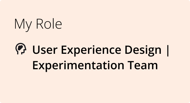
As part of a dedicated experimentation team, I served as the sole User Experience Designer supporting Lou & Grey, a women’s apparel brand with a persistent conversion problem. Conversion held steady at a 0.9%, well below industry benchmarks, and the business knew something was broken, but not what or where.
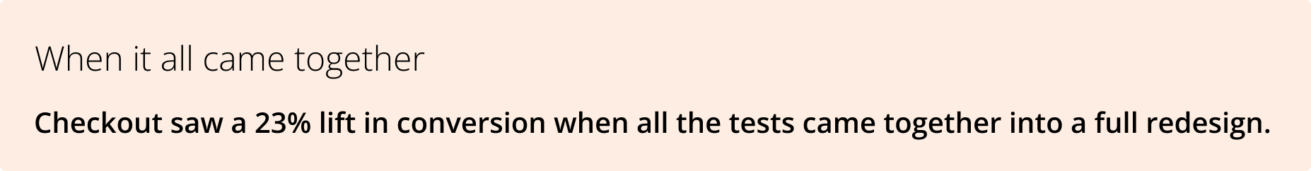
My role was end-to-end: partnering with stakeholders to form hypotheses; designing and prototyping test variants, and interpreting results to inform the next round of experiments. No single test produced the lift; it was the compounding effect of many small, well-targeted changes over time.
The Problem
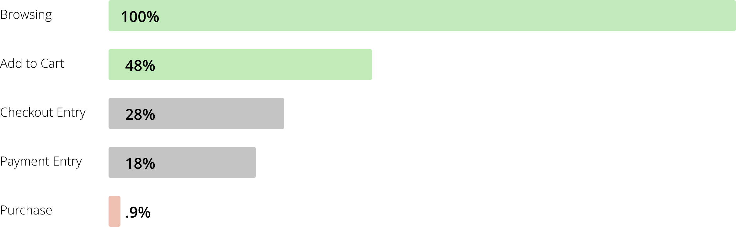
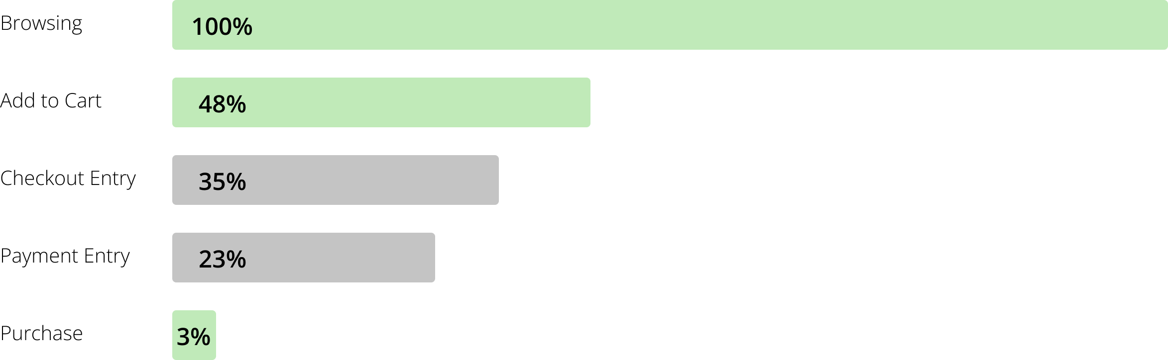
Lou & Grey's checkout was converting at 0.9%, users were abandoning at every stage, not one catastrophic moment. The challenge was identifying which friction points to address first and in what sequence. Analytics and session recordings told a clear story before we ran a single test.
Four distinct friction patterns emerged:
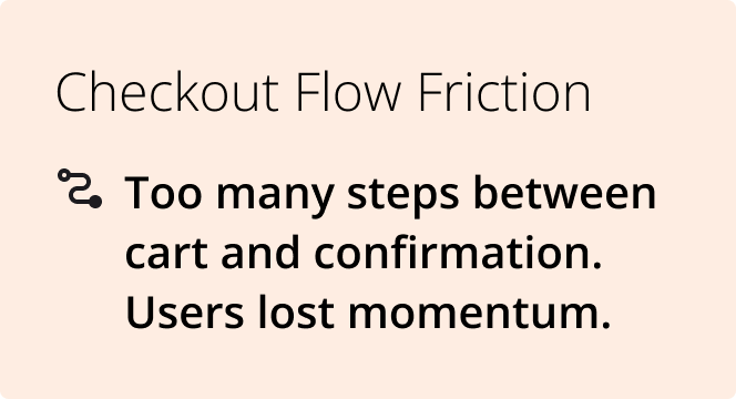
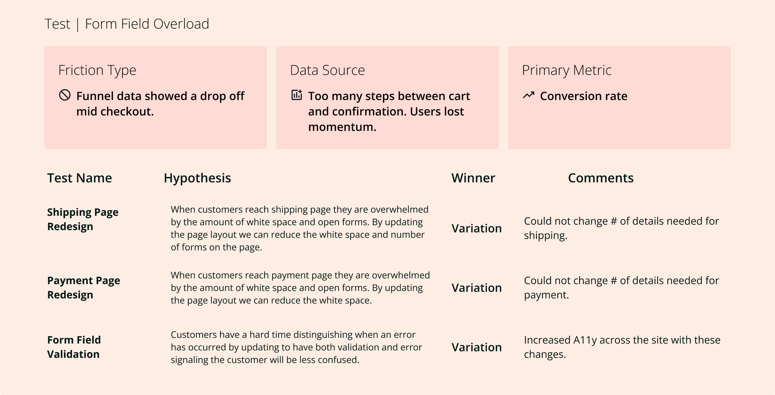
Checkout Flow Friction
Too many steps between cart and confirmation, users lost momentum.
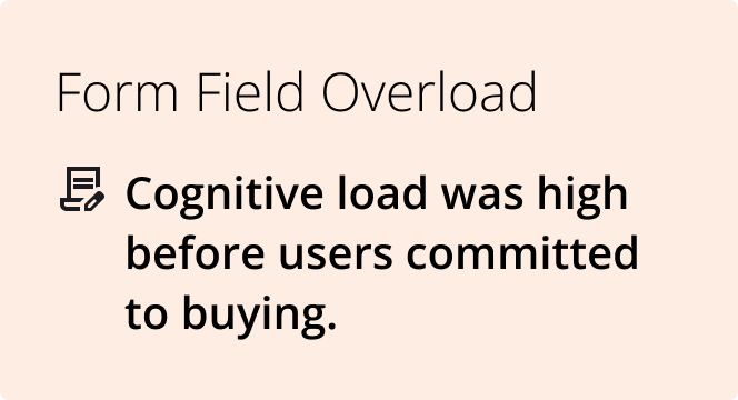
Formfield Overload
Cognitive load was high before users committed to buying.
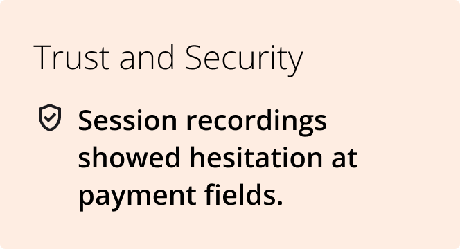
Trust and Security
Session recordings showed hesitation at payment fields.
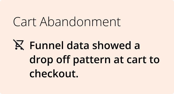
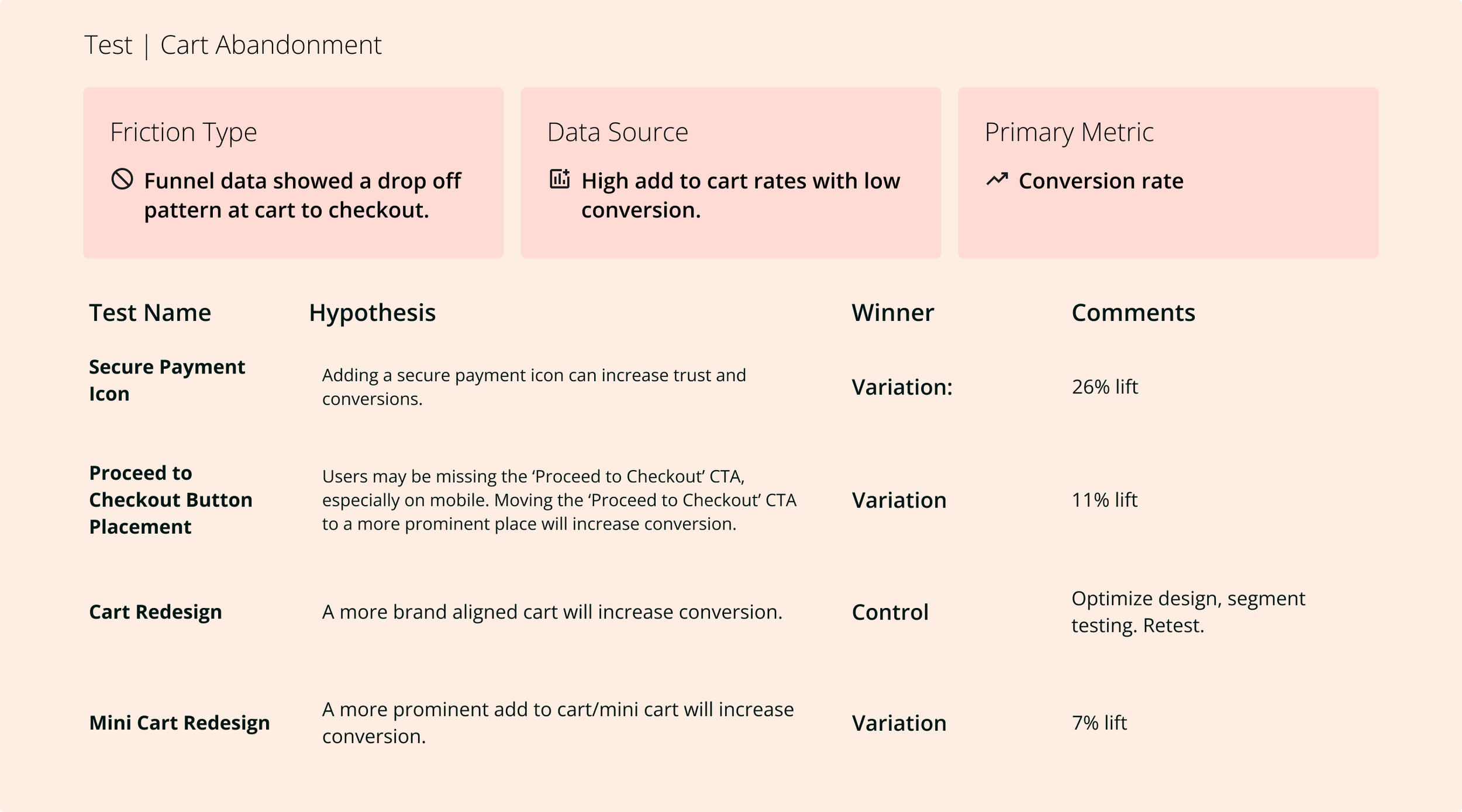
Cart Abandonment
Funnel data showed a drop-off pattern from cart to checkout.
Design Process
Hypothesis-driven, not opinion-driven
Every experiment started with a formal hypothesis before a single design was created. This discipline, shared across the team, kept the program focused on learning, not just shipping variants.
Data synthesis
Combined funnel analytics with session-recording analysis to identify specific drop-off moments and user behaviors. Looked for patterns across sessions, not individual outliers.
Hypothesis formation
Wrote structured hypotheses: "We believe [change] will [outcome] because [data insight]." Partnered with the analyst to prioritize by potential impact and ease of isolation.
Variant design
Designed test variants with one variable changed at a time. Maintained brand fidelity while isolating the specific element being tested, ensuring results were attributable to the change, not noise.
Prototype and QA
Built high-fidelity prototypes for stakeholder alignment, then partnered with developers through implementation to ensure test variants matched design intent exactly; a corrupted variant produces meaningless data.
Results analysis and iteration
Reviewed results with the analyst after each test. Win or loss, the result informed the next hypothesis. Losing tests were often as valuable as winning ones; they ruled out explanations and sharpened the model of what users actually responded to.
Funnel: Before Optimization
Analytics told us where users left. Session recordings told us why. Together, they shaped every hypothesis we tested
Funnel: After Optimization
Four Key Areas for Testing

Overview
One brand, one problem, relentless iteration
Four friction points, one broken checkout
Focus: Cart
Version: Control
Desktop
Page doesn’t take up more than 1080px
The estimated total isn’t easily distinguishable
Product tiles waste vertical and horizontal space
Banners, navigation, waste vertical space
Trust low no “secure payment” signifier
Mobile
Banners, navigation, promo code, waste vertical space
Product tiles take up too much vertical space, and fonts are too small
Need to scroll to proceed to check out CTA

Focus: Cart
Version: Redesign
Desktop
Seamless transition from cart to checkout
Utilizes the entire screen (Reactive design)
Product tiles use space more efficiently
Matches the brand's look and feel
The estimated total is clear
Mobile
Banners and navigation were removed from the top of the screen
Experience matches the desktop seamlessly
Product tiles efficiently utilize space
Proceed to checkout, CTA is easy to find with minimal to no scrolling
Focus: Checkout
Version: Control
Desktop
“Accordion” style bounding boxes for each information section, must fill out first section to see next section
Total and order summary too small
The page refreshes with each section completion, making the checkout process slow
Mobile
Vertical space is lost to unnecessary banners, global navigation, and checkout navigation
Feels like a completely separate experience from the previous cart page
Checkout navigation is introduced, calling out ‘bag/cart’ but not included on the cart
Input boxes are too small for standard click radius
Focus: Checkout
Version: Redesign
Desktop
“Accordion” style bounding boxes for each information section, must fill out first section to see next section
Total and order summary too small
The page refreshes with each section completion, making the checkout process slow
Mobile
Vertical space is lost to unnecessary banners, global navigation, and checkout navigation
Feels like a completely separate experience from the previous cart page
Checkout navigation is introduced, calling out ‘bag/cart’ but not included on the cart
Input boxes are too small for standard click radius